Refreshing a Landing Page
UX, UI, and collaboration during a landing page refresh for Think Twice.
Overview
The team at Think Twice wanted to improve their landing page. Designed internally, it evolved over time and helped them grow from a single-product offering to a suite of products and partnerships.
At a key turning point for their business, Think Twice wanted to bring in a design specialist to refresh the landing page and drive revenue growth.
At a key turning point for their business, Think Twice wanted to bring in a design specialist to refresh the landing page and drive revenue growth.
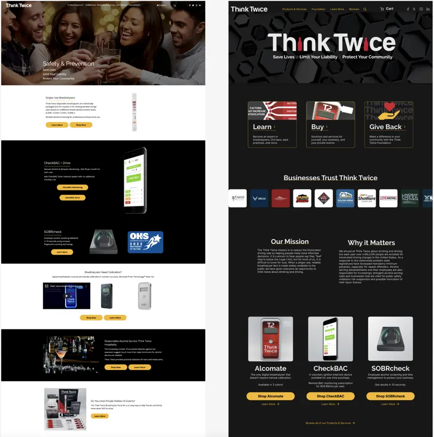
Left: The legacy landing page for Think Twice. Right: The redesigned landing page designs we created.
Through research, UI goals, and standardization I helped solve for pain, modernize the look and feel, and increase learnability. Through stakeholder presentations and delivery documentation I made it easier for other people who’d work on this to do their jobs.
We’ll break down this case study into three sections:
We’ll break down this case study into three sections:
UX Goals
The first step was for me to look at the site as is. I used Jakob Nielsen’s 10 Usability Heuristics to provide a structured look at how we might improve the site.
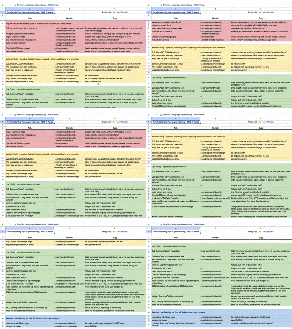
While auditing the legacy page, I categorized my notes by heuristic.
Next, I facilitated a discussion and had the Think Twice team come up with three important tasks they want people to complete on their site. These tasks were representative samples of three bigger goals for their site:
• Buy a product: drive e-commerce revenue
• Learn a fact: provide information to people and position the company as a center of knowledge
• Make a donation: drive donations to their 501(c)3 foundation.
I wrote a script and conducted 5 remote moderated user tests on the existing website, then presented findings and insights with an interactive, readable take-home deck.
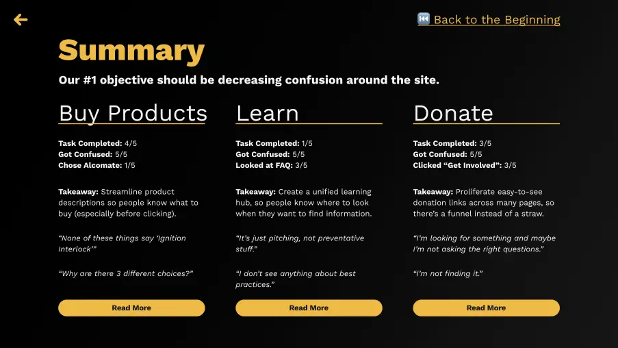
This slide serves as both a summary and a jumping-off point to learn more about any individual topic.
Our goal for the new design was to reduce confusion. Using what we learned from the first round of user tests, I built a functional wireframe prototype.
The wireframes tested well!
Task completion was up by 40-80% across the board, and confusion was down 80-100%.
The wireframes tested well!
Task completion was up by 40-80% across the board, and confusion was down 80-100%.
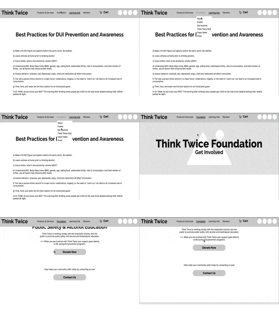
The wireframe tests showed that this design was on the right path.
Compared to the confusion and frustration expressed in the first round of tests, my notes on one second-round tester’s experience reflect the ease with which they flew through the tasks. It shows curiosity about products without dejection or self-doubt, and 100% task completion without taking wrong turns.
What doesn’t show in the notes is that this test took about 5 minutes, where the first round frequently took 40-50 minutes. In short, the new tests were a resounding success.
What doesn’t show in the notes is that this test took about 5 minutes, where the first round frequently took 40-50 minutes. In short, the new tests were a resounding success.
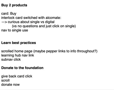
Notes taken during one test show how quickly tasks were completed.
Using these wireframes as a guide, I built hi-fi mockups that we could deliver to the dev team to build.
UI Goals
While making progress on the UX goals of driving purchasing, making it easier to find information, and simplifying the foundation’s donation process, I also pushed forward on some UI goals for the project. The brief was to "modernize" the UI, and I brought in some fun imagery, but I wanted the UI work to achieve some psychological goals as well.
Let's talk about 'em.
On the legacy site, users had to reorient themselves for each section. This decreased predictability and learnability, since each section lacked a cohesive visual link to the sections around it. I wanted to structure the UI to increase a sense of flow and belonging, so I introduced some new consistencies:
• Button size and position: On the legacy site, buttons were different sizes and could be to the left, right, or underneath their corresponding text or images. In the new design, all buttons were the same size and located directly below the content.
• Page alignment: On the legacy site, the average button position resulted in a 6˚ slant across the entire landing page. In the new design, the average button position was a straight line down the middle of the page.
• Module link content: On the legacy site, some modules had links to buy and some had links to learn. Some button titles were the name of a device. In the new design, every button had a clear verb in its button text, purchase links were prominent, and learn more links were included as secondary text links below the buttons. These changes were aimed at driving the revenue goals of the redesign.
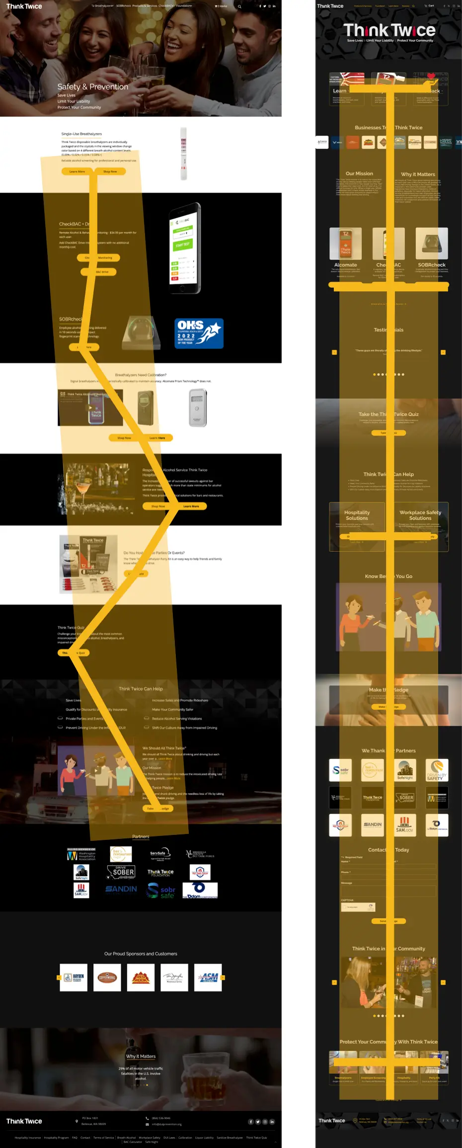
Comparing the average button position for the legacy site (left) vs the new design (right), you can see that the new design balances the page from the middle.
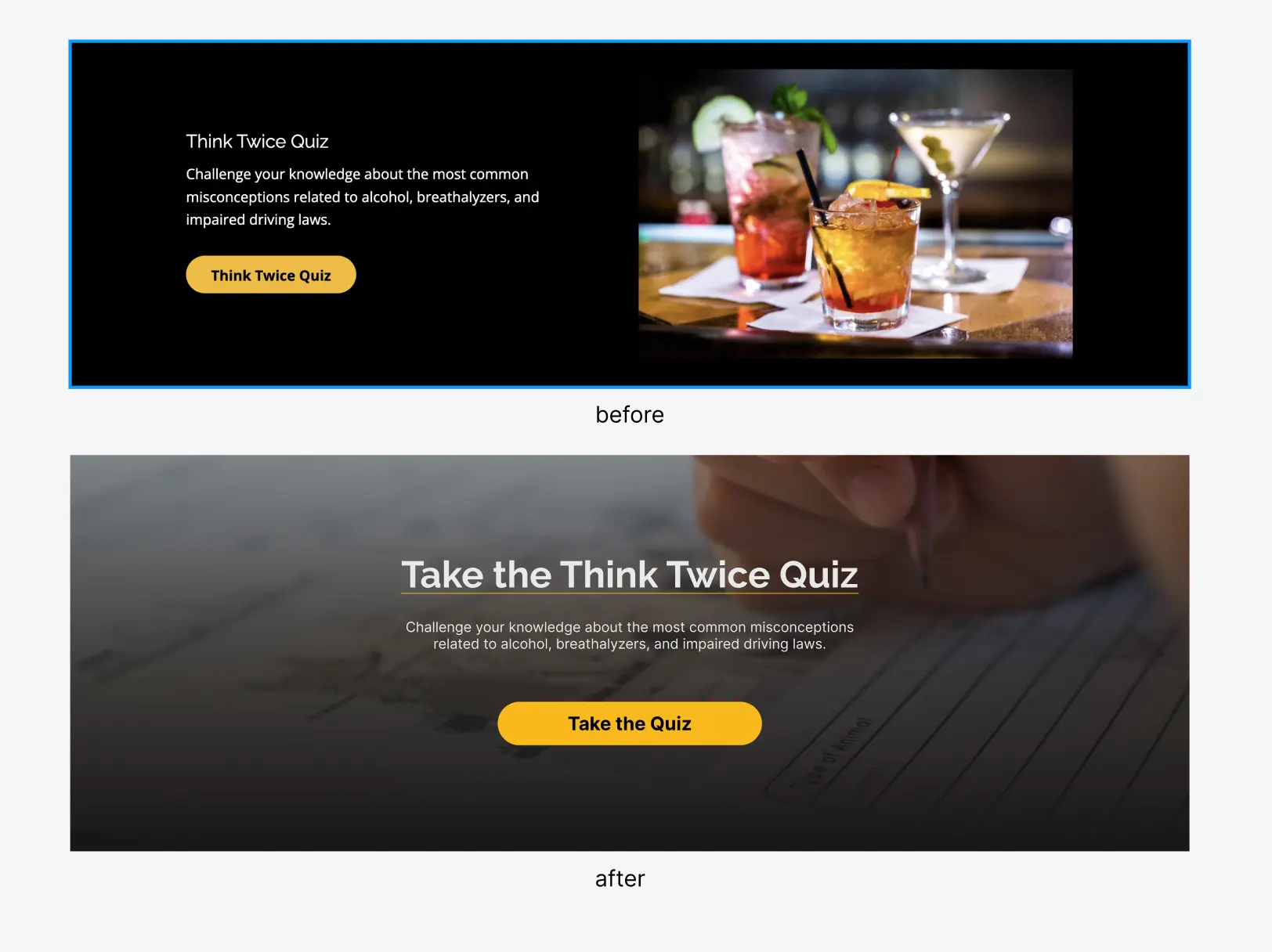
Modern interfaces often include full-width images, set over scrims that ensure text legibility. In addition to that modernization touch, I centered everything to echo the macro-patterning on the page, had the button text echo the title of the module, and chose an image that would suggest what's coming next.
These changes all fall under the category of "modernizing the look and feel," but really they support two intertwined goals.
• First, the attention to balance makes the page feel somehow safer, more pleasant, and more secure.
These subtle psychological nudges remove a sense of uneasiness in a way that's not often something people can articulate. They'll say things like, "this looks nice," or "it feels good," but what they're really reflecting is the fact that things tend to be where they think they'll be. To maximize their potential, these UI goals must be supported by user-centered consistencies in UX, Interaction (IxD), and Information Architecture (IA).
• Second, by reducing uneasiness and increasing learnability, people are more likely to explore, trust the company, and purchase.
Without being overbearing, I like to make it as easy as possible for anyone who wants to make a purchase to give the company money. (Need some work done? Send me an email or reach out on LinkedIn.)
Clear, verb-based CTA labels and consistent, repeated patterns support that goal, whose potential is also maximized by good UX, IxD, and IA.
Collaboration
Throughout the hi-fi design process I’d make initial assumptions, and then involve the Think Twice team in honing the design. Since they’re the experts on their current business, its public persona, and their future goals, I wanted their direct input on some pivotal choices.
But, since they’re super busy working on other parts of the business, I also wanted to increase the time-to-impact ratio of each meeting by pre-building options and presenting them with a small set of viable choices.
This did two things.
• First, by bringing completed options to choose from, I could reinforce their faith that they’d chosen someone who would do quality work without needing handholding the whole way.
• Second, by bringing completed viable options, I could give the Think Twice team a felt sense of ownership over the design that they’d helped select. No matter which option they picked, I could support their choice knowing it would serve the project goals.
I won’t share the strategic product choices we made in this way, to preserve their competitive advantage, but here's an imagery-centric example:

By including several viable options and their reasoning, I could let the stakeholders make an informed choice.
Slide decks. Let's talk about em.
I made sure to use Think Twice's style guide to build out a decks that felt as naturally like their product as the web page did. This made the decks feel like it was their own material, so they wouldn't have to do any mental labor to conform to me. They could also share them around as needed, and it would still feel like their own insights.
Early on in the project, Think Twice's CEO mentioned judging a deck by its last page. Knowing that’s where he’d look first, I included functional links to make the last page an easy jump-off point to reach any part of the deck he might be interested in.

Structuring the summary like a clickable table of contents takes advantage of the digital era by making the deck an interactive experience.
This deck was about gleaning high-level insights, so I didn’t want to force the client to read through my research data. I did want to give them the option to access the data though, so I included external links to documents where they could go as deep as they might want.
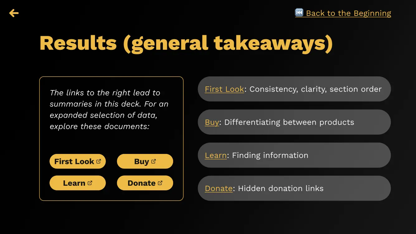
The yellow buttons linked to nicely arranged and presentable data stored on a shared drive in the cloud. This data was summarized in the deck.
Developer collaboration. Ready?
Each project is different, and from the beginning of this one I knew I was handing off the hi-fi designs to an independent developer who I might not have extensive contact with. I wanted to be sure my specs were as specific as possible, and I did this in a few ways.
First, I included extensive margin notes around the hi-fi mockups, to make it easier to check things off. I wanted to eliminate as much guesswork as possible.
Did I do this? Check.
Did I do that? Check.
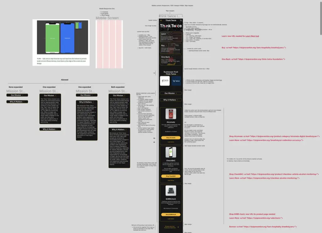
The handoff spec document included margin notes about interaction patterns, grids, links, spacing, and reasoning behind certain choices.
Next, I included specific breakdowns for persistent sections (like navigation and search).
I showed interactions, UI specifics, and rationale behind a lot of the decisions. Again, the goal was to help chunk out the work and make it easy.
I showed interactions, UI specifics, and rationale behind a lot of the decisions. Again, the goal was to help chunk out the work and make it easy.

By breaking down specific sections of the navigation, I could describe interaction patterns and edge cases, like what happens if there are 3+ digits worth of items in a cart, or how a search result dropdown might look on hover.
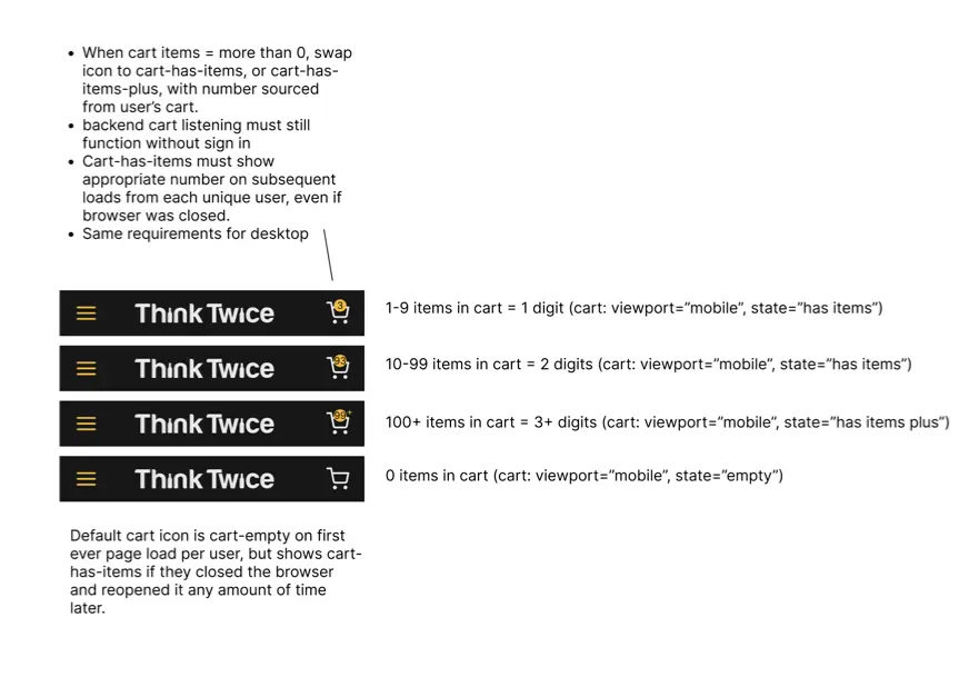
Margin notes described success criteria for behavior, too.
I included a style guide with colors, typography, and grids so that all future work on the site can be standardized. I also included a section describing components I reused across the page. Pre-building these components will make it easier to swap out content in the future, making it easier to build new pages and run experiments.
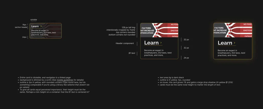
For each reusable component, I described interaction patterns and UI for both mobile and desktop breakpoints.
In addition to these still frame specs, I included working interactive Figma prototypes so devs can see animation and interactions as they build out the site.
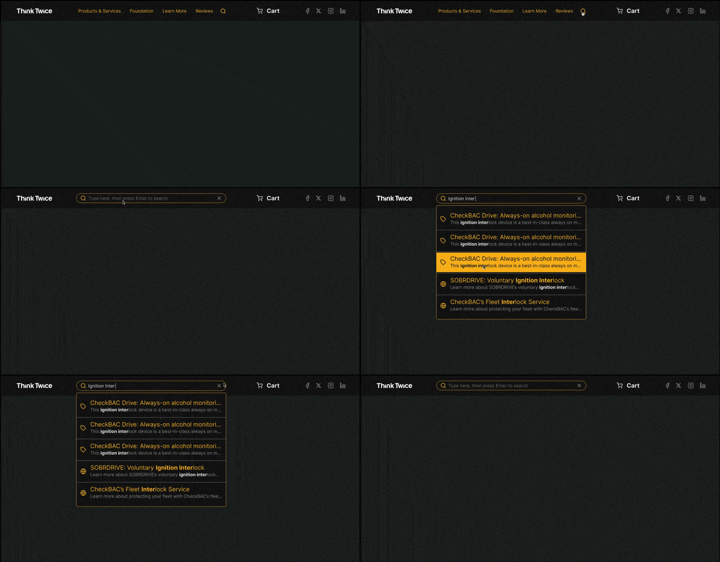
Showing interactions is easier than trying to describe them.
Separate from the component-specific interactive prototypes, I included a full working prototype of both the mobile and desktop versions of the site. By looking at these, the development team can see how the whole picture fits together.
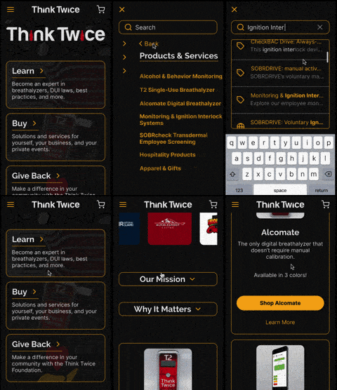
Linking together a fully functional interactive Figma prototype like this is a fun way to see if all of your component interactions are built correctly.
The best situation for me is to be physically in the room with the development team, but that’s not always possible. By being as specific as I can about the tiny details in my spec, I can help reduce confusion and increase the probability of getting back exactly what we want. By including rationale, I hope to make it easier for dev teams to make choices when they need to make a decision on the fly.
One last consideration was to make as much of a human connection as I could with the developers. It’s possible to come off as overbearing or condescending when you’re including that much detail and haven’t met face to face. I tried to nip this in the bud by writing a short intro readme that sets a tone of collaboration, explains my mindset, and gives respect to the creativity and craft involved in great development work.
The result? Historically, devs had returned ~65% of any request to the client on a first pass, then a few rounds of iteration would get it close to 100%. On our first pass, the devs returned ~85% of what we asked for, saving our team over a week of projected wait time.
Wrap Up
This project was a great opportunity to work with a client that was vocally into me doing research, using what we learned, and innovating on a site that could help them get to their revenue goals.
They placed a lot of trust in me and my process, and I reciprocated by presenting information in a way that they could use it to sell changes to their board, by delivering quality choices, by rigging up working prototypes to play with, and by laying down groundwork to make any future projects around the site—whether done by me or by someone else—as easy as I can.
We used heuristics, user testing, iterative design cycles, and interactive prototyping to build a hi-fi mockup of a responsive site that’s expected to increase revenue, donations, and ease of finding information once it goes live. Since I would only have minimal contact with an external development team, I built out a spec with a lot of detail to increase both build speed and accuracy, while opening with a tone of respect for their profession and craft that hopefully can open doors to collaboration.
And in the end, we made a pretty badass webpage for a business that helps save lives.
When the new site is live, I'll link to it [here].

One last time, a side-by-side of the legacy site and the redesign.

