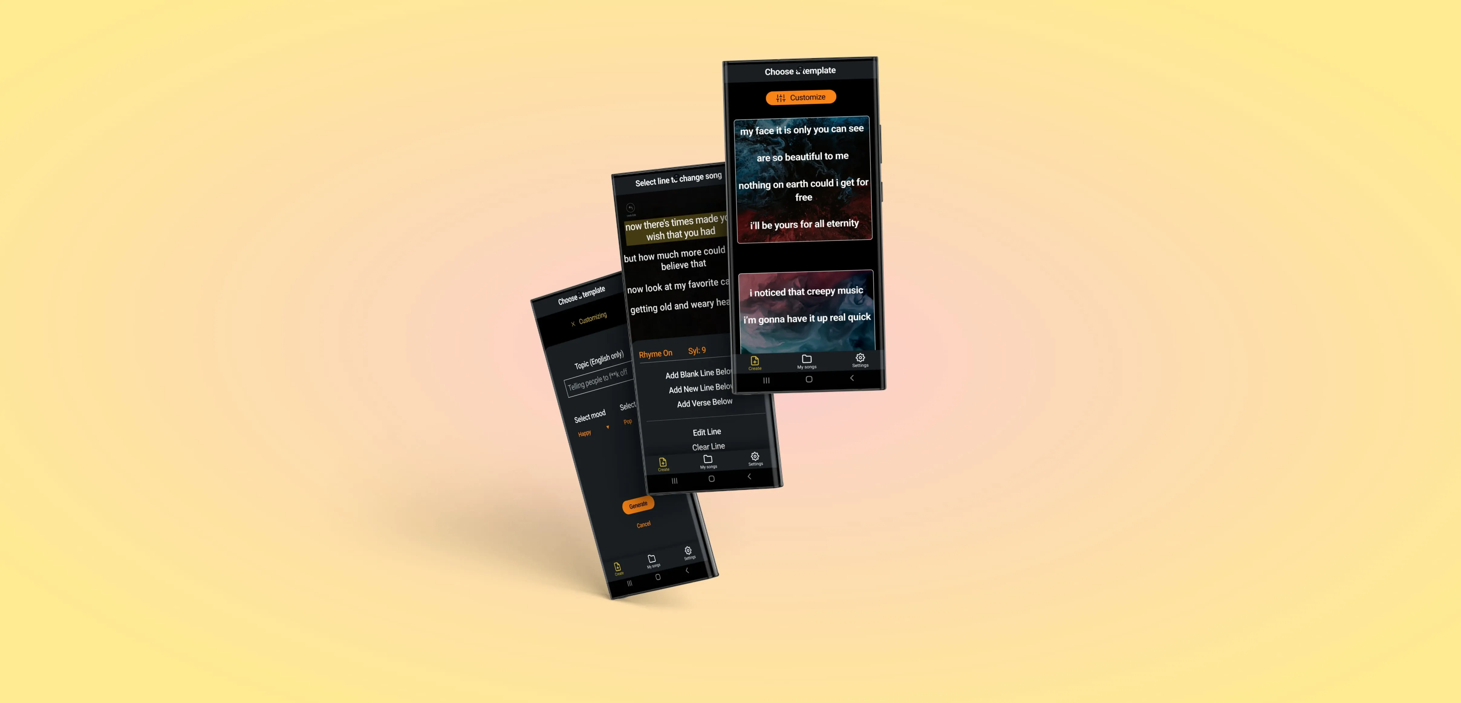
MyLyricsMaker is a Generative AI tool for creating music lyrics. It lets you set parameters like mood, genre, and syllable count.
The happy path through the app is:
1. Generate a lyrics template.
2. Edit the lyrics.
3. Save and export the lyrics.
The app is for anyone who wants a starting place for lyrics creation.
From the blurb on MyLyricsMaker's Google Play and Apple Store download pages: “This AI lyrics generator makes writing lyrics fast, fun, and easy."
Our Project Manager was contacted by MyLyricsMaker, who wanted to:
1. Increase daily users.
2. Decrease usability complaints.
My role
I was one of two UX Designers recruited for this project by the Project Manager. We used Discord to video chat while we worked collaboratively in Figma. I worked hands-on with the UI, I was vocal in decision-making, and I wrote out margin notes for the developers (for which I was later thanked directly by the founder).
Project overview
The project included:
1. Assessing current state.
2. Restructuring information architecture.
3. Enhancing functional clarity of visual elements.
Project engineers pushed our recommended changes in 2-week cycles over the course of our 3-month engagement.
We met with the founder 3 months after the engagement ended to talk about results.
Goals and Results
MyLyricsMaker's goals for the engagement were:
1. Increase daily user count.
2. Decrease usability complaints.
We worked for 3 months and met with the founder 3 months after finishing. In those 6 months:
1. Daily user count increased 40x, from 10/day to 400/day.
2. Usability complaints decreased to zero.
I'd call that a success!
And more importantly, so did the founder.
Tools
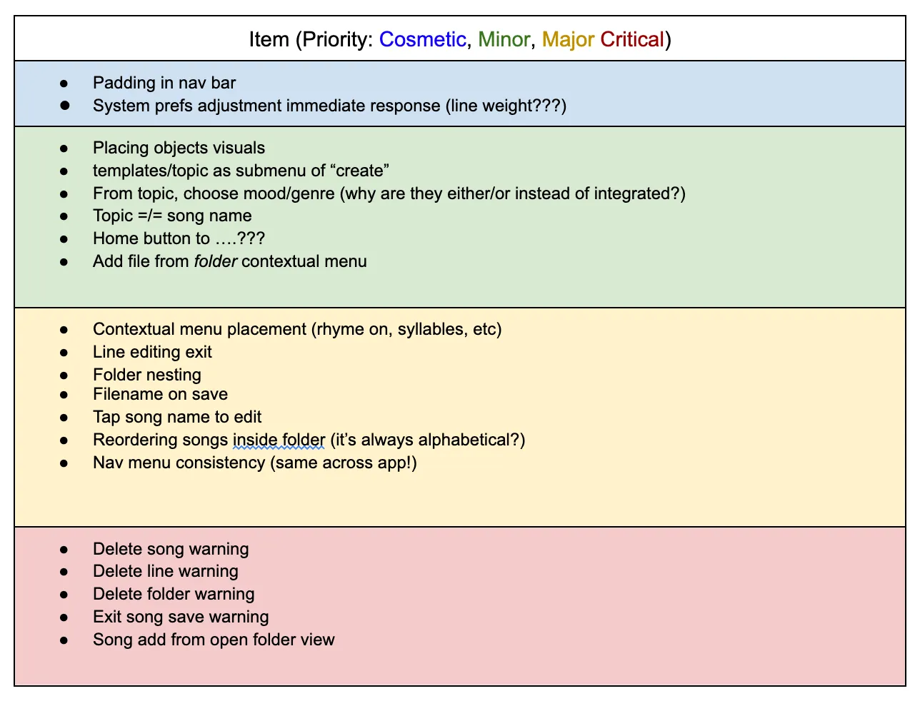
Heuristic analysis
The first step was to
assess the state of the app.
The other designer and I each walked through the app twice and
talked aloud about what we noticed. The Project Manager took notes.
Then we distilled those notes into to
actionable items,
categorized by importance.
NOTE: For projects with a low level of trust or lots of needed design evangelism, it can be useful to match each action item with a usability heuristic. This project was fast, scrappy, and had a high level of trust. Our development partner didn't require a heuristic justification for each change, so we kept it simple. This step was mostly for us.
For more about heuristic analyses, check out
this article from MIT.

Our categories were organized in terms of how likely not doing them would turn away potential users.
Nice to haves will improve experience and are mostly Cosmetic and/or Minor changes.
Major changes are sources of frustration that can be cleared up.
Critical changes are things that could cause users to lose money, time, or work, and might be reasons to leave the app altogether if left unaddressed.
Information Architecture

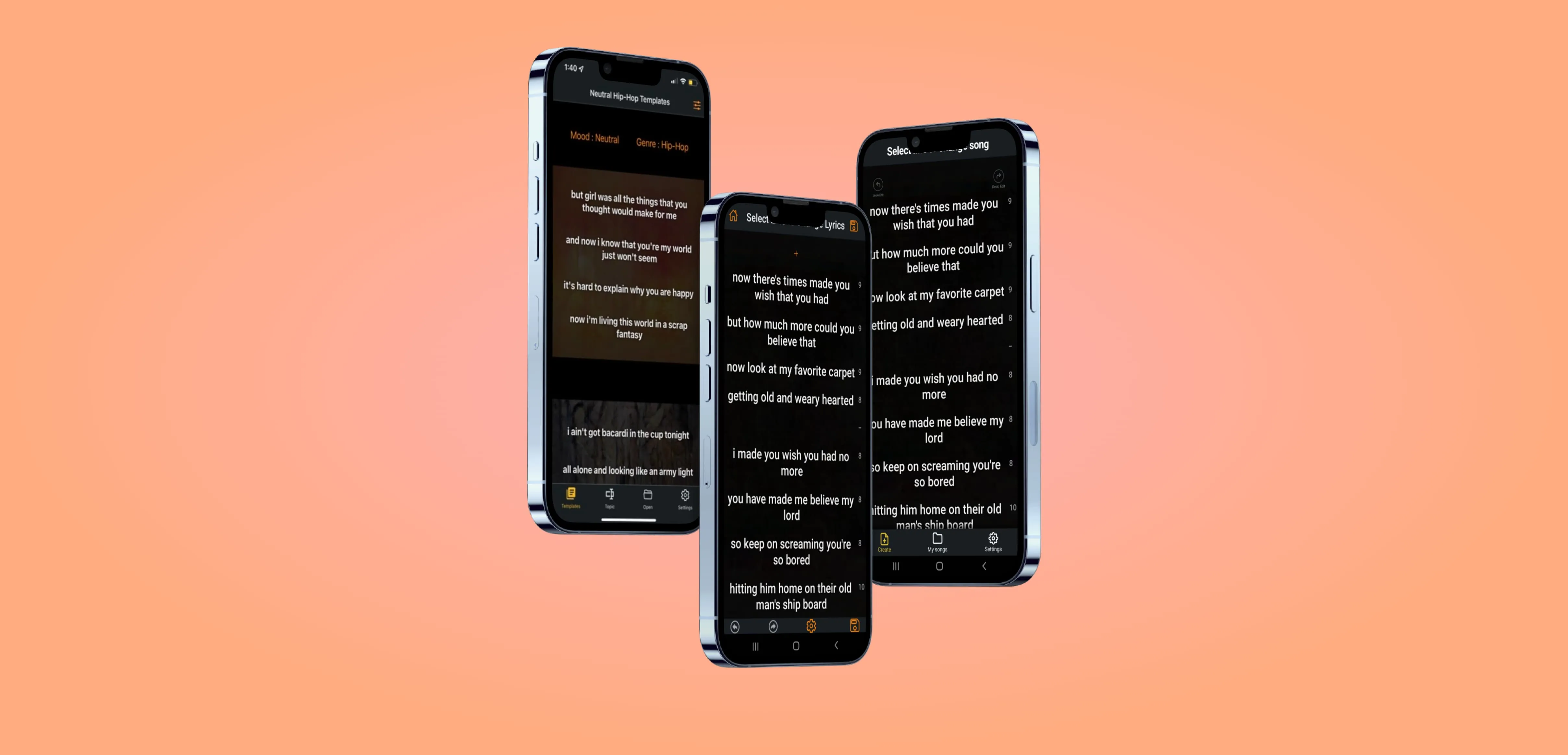
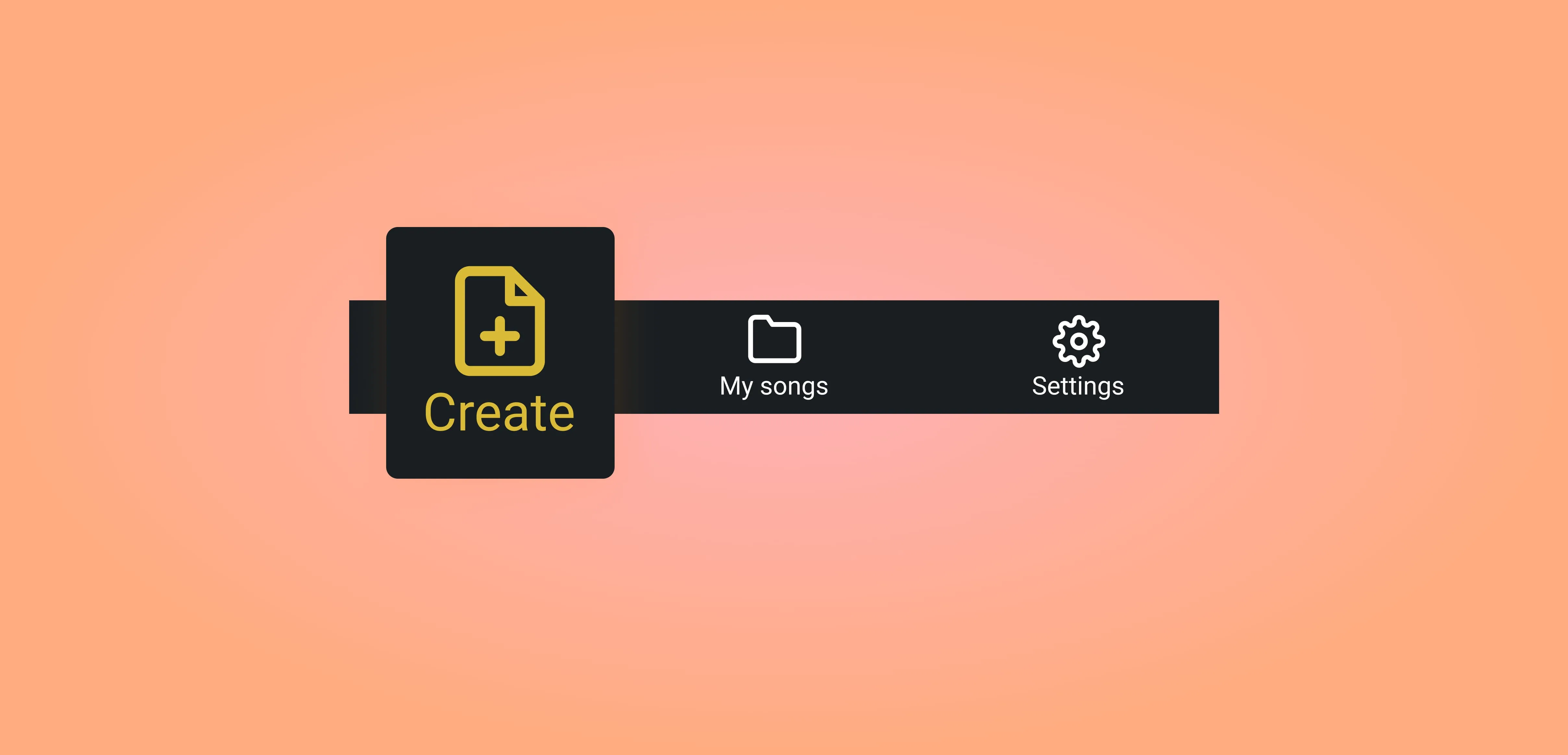
We clarified the purpose of the navigation bar, made it consistent, and simplified it from 4 to 3 buttons.
Our restructuring of MyLyricsMaker's
Information Architecture helped MyLyricsMaker maintain a
clearer navigational hierarchy for its users.
Nielsen's Fourth Usability Heuristic,
Consistency and Standards, urges makers to:
1. Maintain consistency within a single product.
2. Follow established industry conventions.Our redesign of MyLyricsMaker's nav bar
improved the app on both of those fronts.
First,
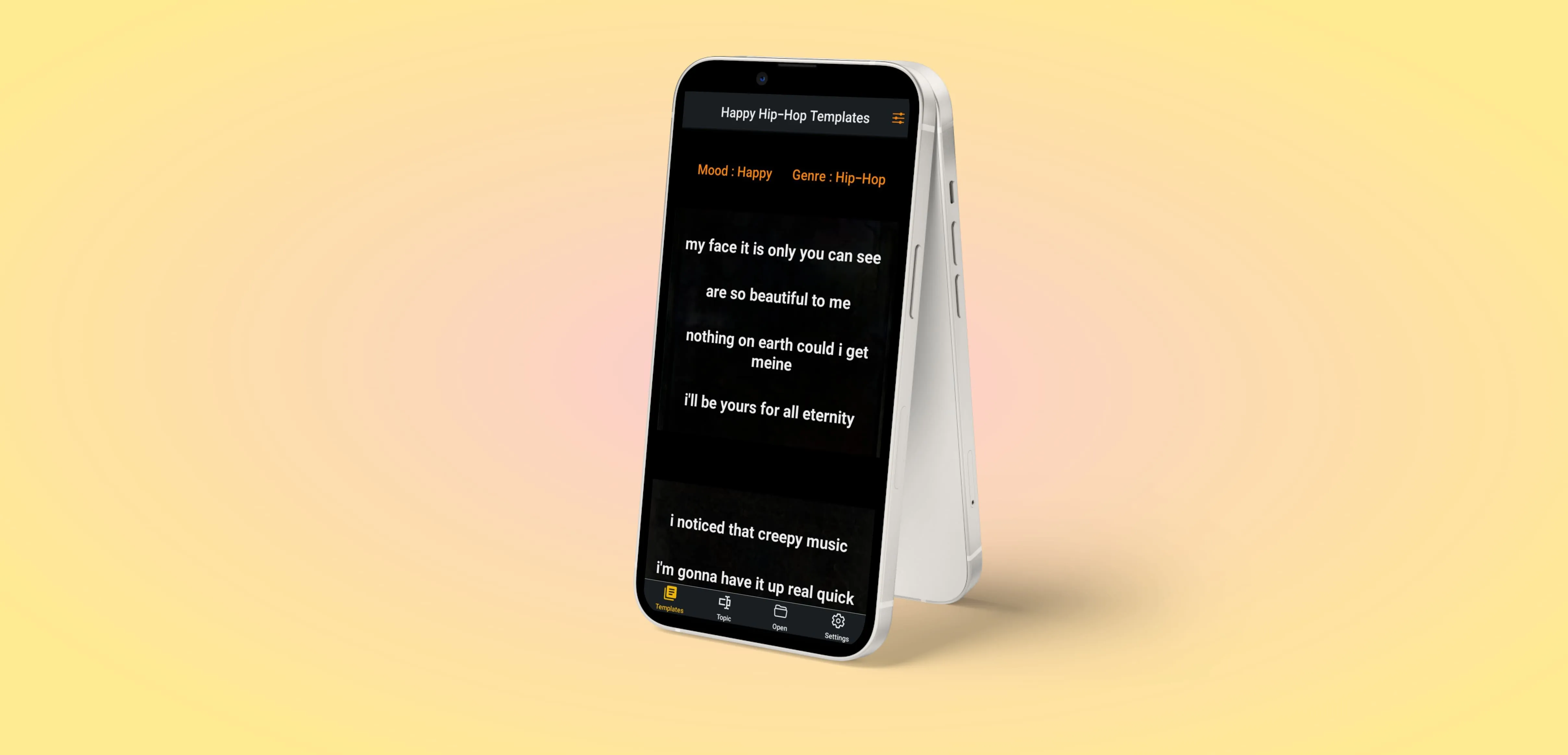
consistency within the app and with the outside world. In the image above, the two nav bars on the left are from the original app build. Both nav bar menus had four items, but the items were different on different screens.
While editing a lyric,
the nav bar switched functions. It became a toolbar offering undo, redo, settings, and save functions instead of consistent high-level app navigation.
This presents
three problems:
1. Changing the nav bar creates an inconsistent experience. Users expect consistency in a navigation bar, not metamorphosis.
2. Using the bottom bar as a toolbar breaks mobile design industry standards. The industry standard is that the bottom bar is for navigation, not editing tools.
3. Hiding functionality reduces a user's ability to move through the app and exit modes at will. Screen real estate
is limited, but removing the navigation function can cause frustration.

We recommend keeping the nav bar consistent and leaving it on the screen unless it's hidden for a specific reason (eg. full-screen media).
Our solution addressed the toolbar's items in two ways:
1. Move the undo/redo buttons to the top of the edit screen.
2. Let users use the Save icon in the Header.
The save icon from the toolbar was actually a duplicate—there are save and exit icons in the header already. We didn't design those into our screens, but communicated with the developer to leave them as is.

Next, we explored what top-level functions belong on the nav bar.
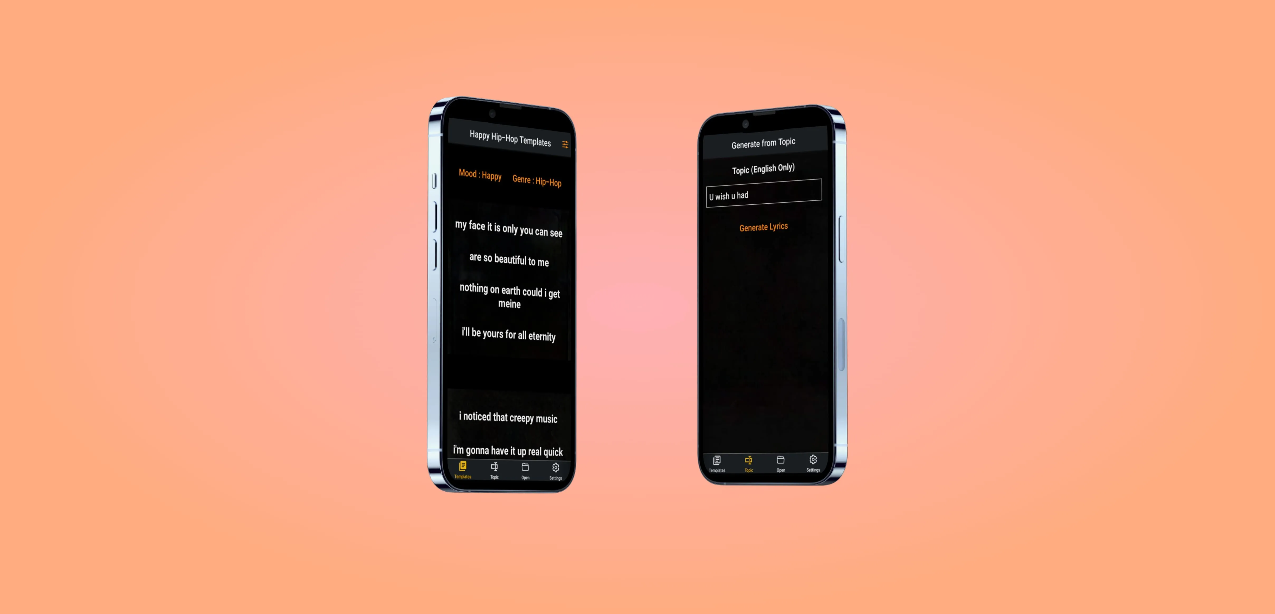
At the start of the project, the nav bar items were:
1. Templates.
2. Topic.
3. Open.
4. Settings.
Templates and Topic are both organization options for operating the AI. They give the user options to edit different parameters and tune the AI to give them different results.
Open brings up the saved file navigation system.
Settings allows user to set settings.

Open and Settings are standards... but are Templates and Topic hierarchically horizontal?
Conceptually, both of Templates and Topic are Creation tools.
However, Topic tunes the AI to generate different Templates; it's a filter mechanism for the AI that generates Templates.
Topic and Templates are not hierarchically equal, they're nested!
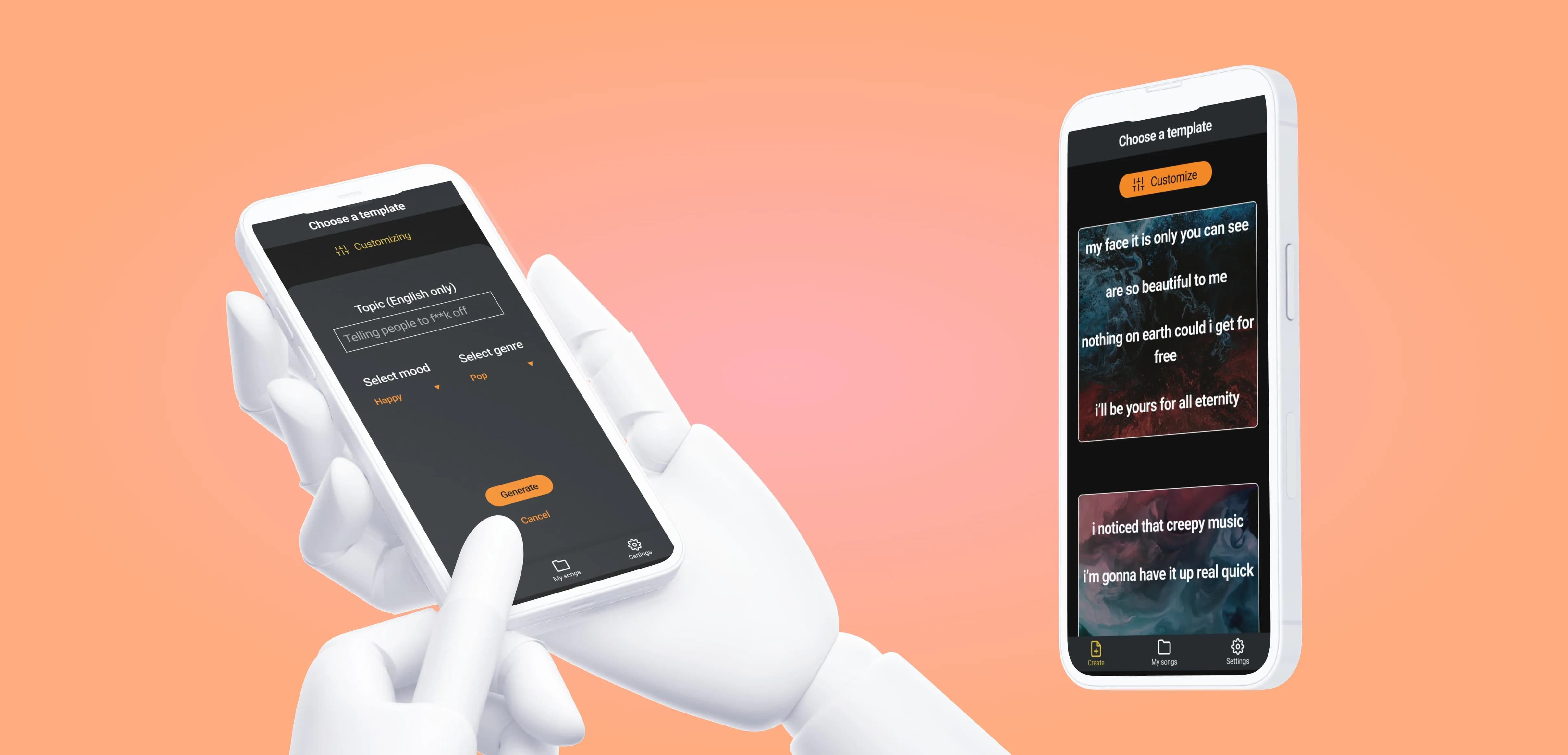
With this justification, we folded the Topic editor into the mood and genre selection drawer, which opens when a user taps the "Customize" button.

That left us with a new question:
What goes on the nav bar?
Both Templates and Topics are sub-sections of a single user action.
In order to choose a template or change the genre/mood/topic of that template, a user must want to create a new song.
We named the nav bar tab "Create."

The second two tabs, Open and Settings, essentially maintained their original functionality.
Settings stayed Settings, and we changed Open's name to My Songs.
"My songs" give users a little bump of pride that they've created something.
"Open" is a classic (shoutout to ⌘-O), but in this context a change can help reduce confusion.
It's possible that Open could imply an import function, which doesn't exist, but My Songs is a clear signifier that the tab is for saved lyrics in the app.
NOTE: MyLyricsMaker has continued to evolve past the end of our engagement, and now calls this tab "My Lyics," which in my opinion is even better than "My Songs." We catalyze positive change.
Visual Design
Our visual design goal was to enhance clarity for the users, and we did this three key ways:
1. Update the cards on the Create page to signify their multiple template option affordances.
2. Group contextual menu items according to function.
3. Give colors specific meaning in the app.

Cards
MyLyricsMaker's tunable AI provides different templates as a starting point for lyrics generation.
On the freshly renamed Create page, those templates are displayed in a list of cards.
Each option contained the first several lines of the verse on a different piece of abstract art that spans the width of the viewport. Each piece of art was separated by a blank space, which indicated the separation between each template.
So far, so good. Kind of.

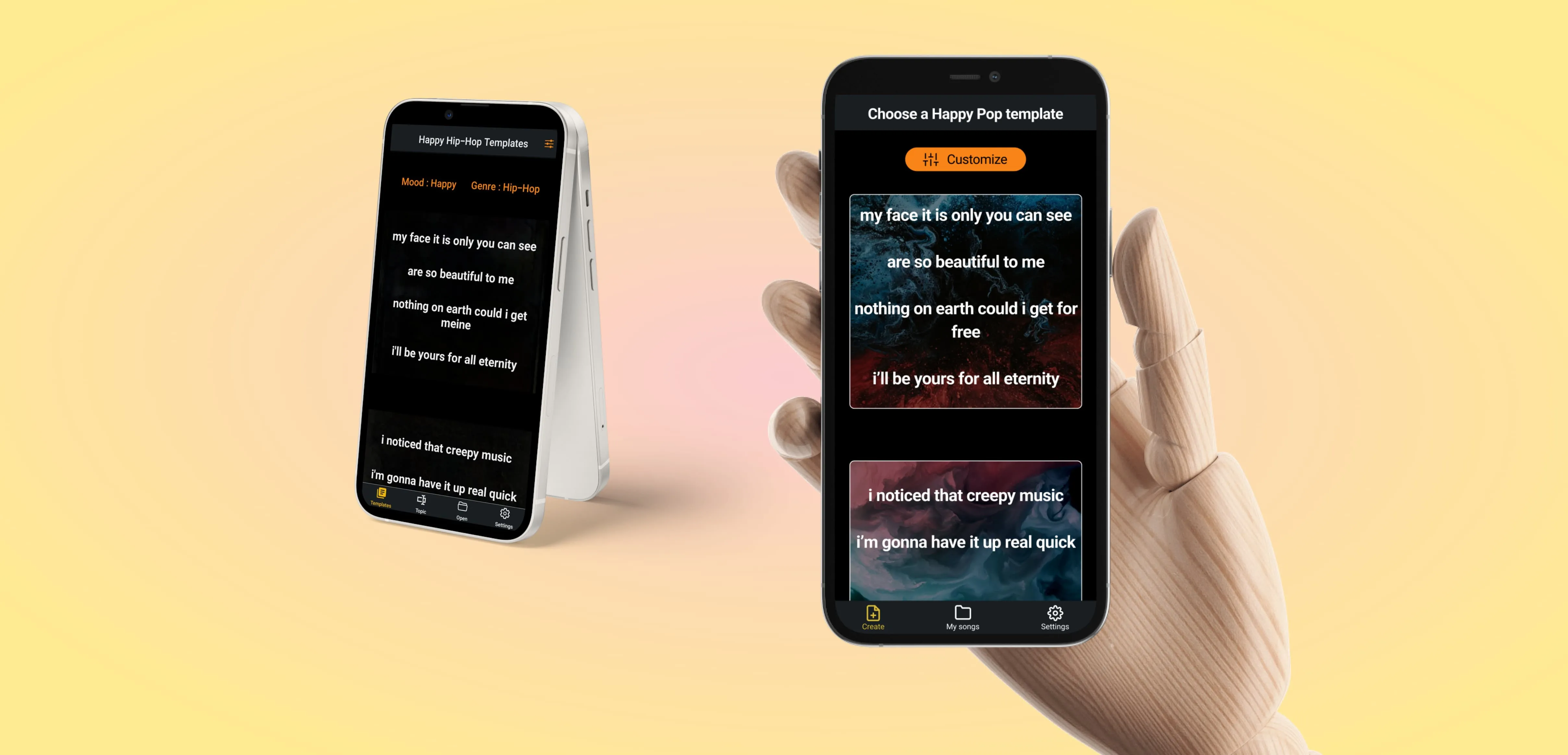
The cards are faded so far into the background that every user tester missed the fact that there were cards at all.
Most first-time users (myself included) thought they were looking at multiple verses of the same template.
(Cue feedback with many variations on the theme "I thought these were different verses of the same song!")

Our new design (shown below) brings clarity to the possibilities embedded in MyLyricsMaker.
We did three main things to give the templates the familiar form of cards:
1. Bring up the opacity of the background art.
2. Bring the cards in from the edges of the viewport with a 16px margin.
3. Add a border to each card.
In our rounds of user testing after making these changes, the users understood immediately that they were being presented with options.
"Oh cool, it gives you a bunch of options!"

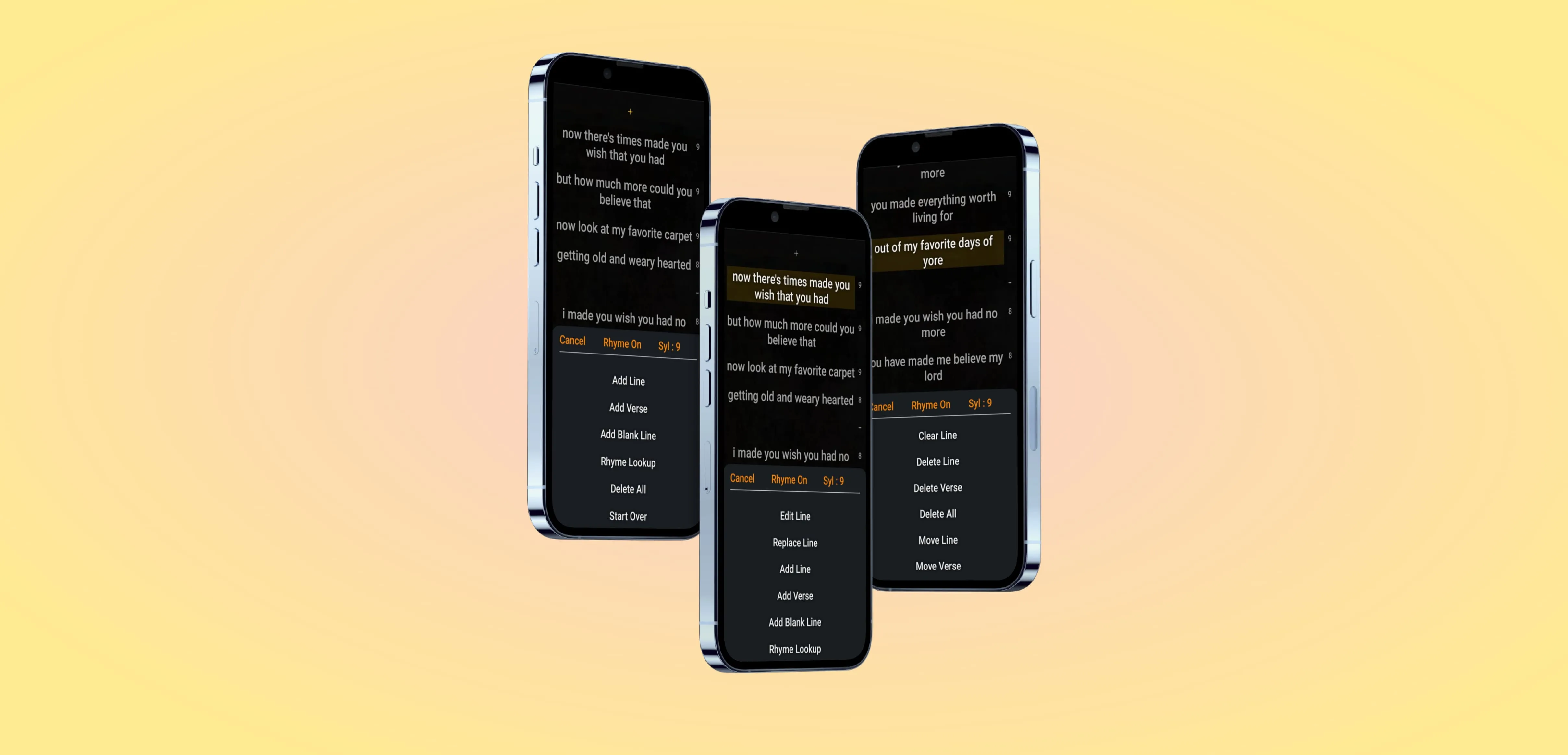
Contextual Menus
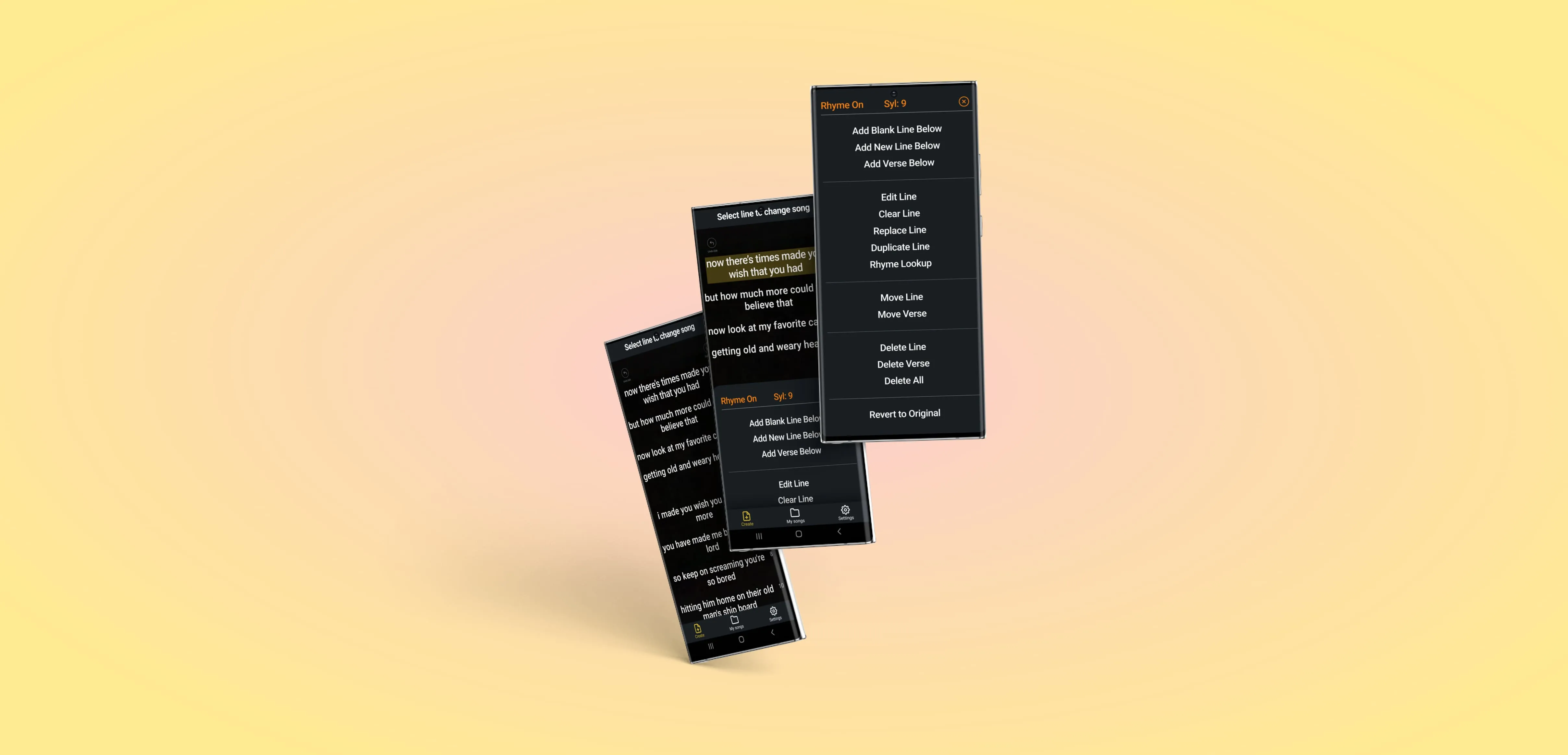
The song editing menus provide a lot of functionality, but there are a lot of items in the list. It can be hard to intake a long list of equally viable options!

According to Nielsen Norman Group, humans can only hold about
7 items in their short term memory at a time.
Chunking is a commonly used and very effective tool to help group long lists into manageable pieces.
We used chunking to
organize the long list of menu items into groups.
Add, Edit, Move, Delete, and Reset functions each became chunks separated with a horizontal line.
To the human brain, this chunking method
converts a long list of 14 items into 5 chunks:1. Add.
2. Edit.
3. Move.
4. Delete.
5. Reset.We didn't name each functional chunk on the page, but we didn't need to; separating each chunk with a horizontal line was enough.
The largest chunk may have 5 items, but the brain can now parse all five of them as 1 chunk for easier wayfinding.
And it's pretty!

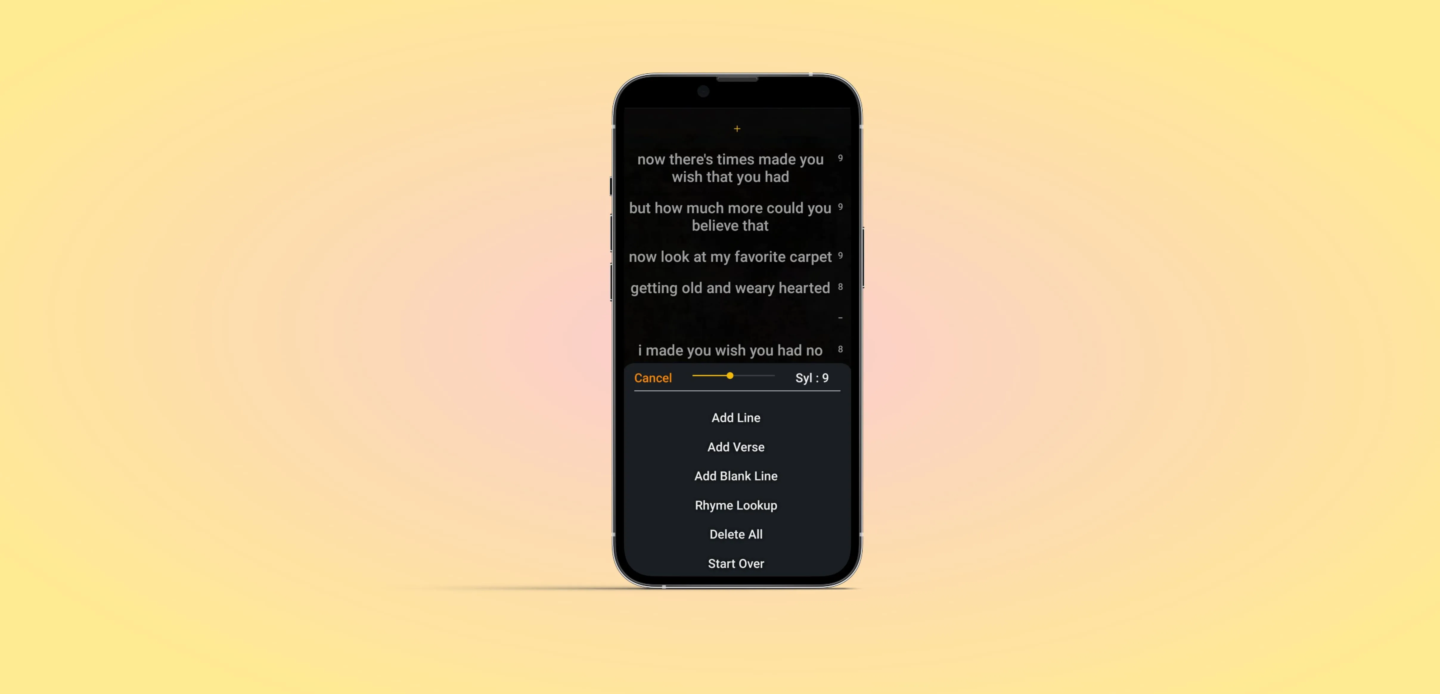
Meaningful colors
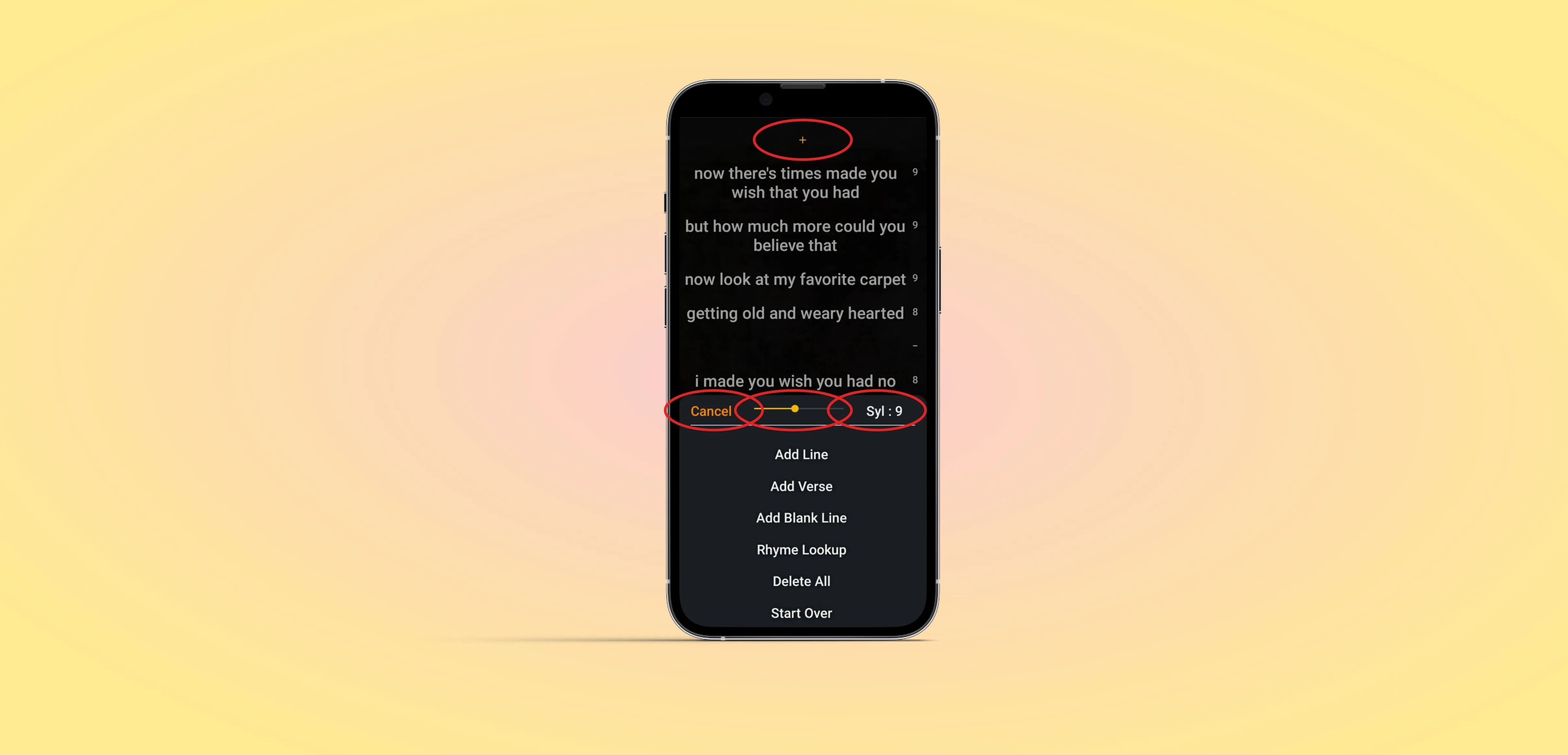
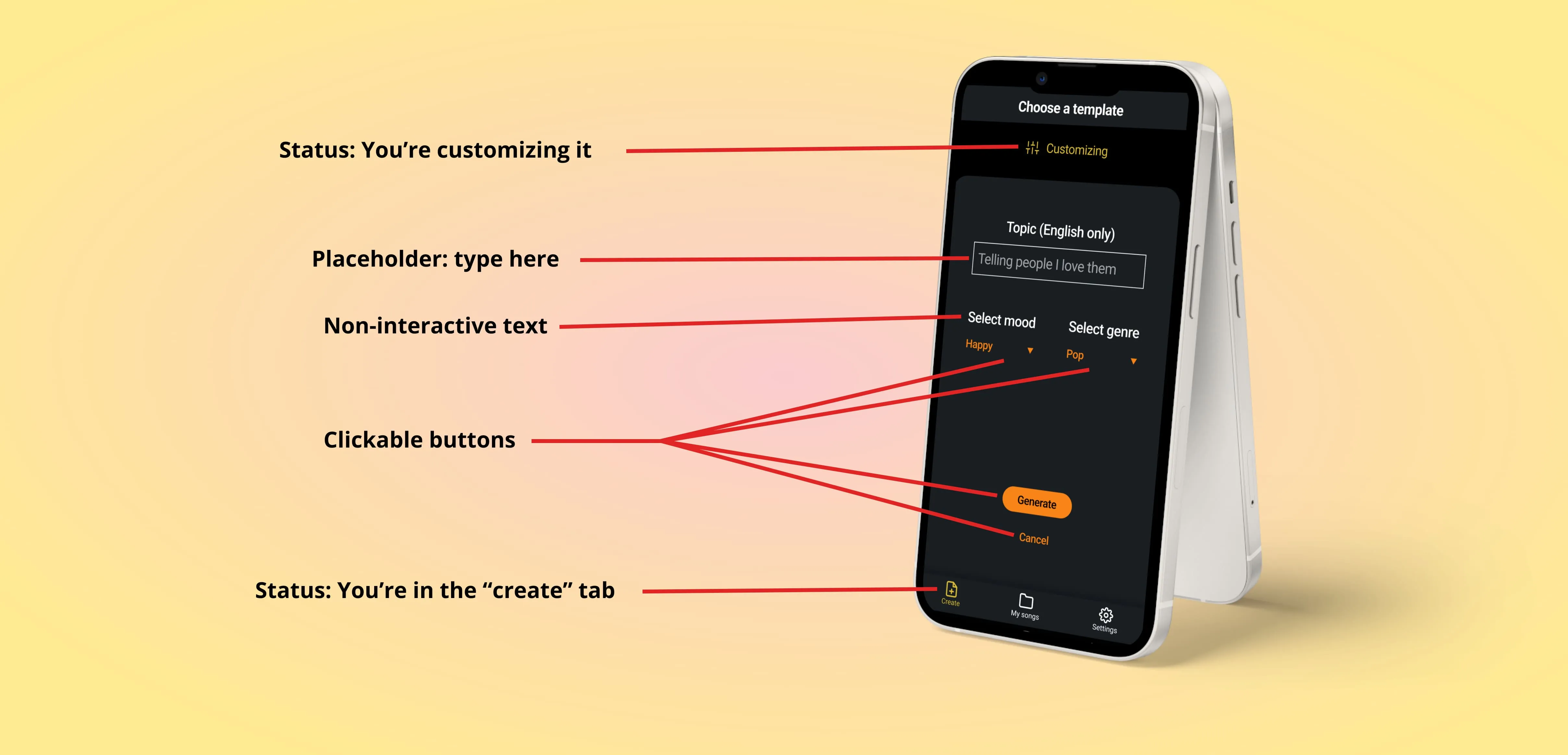
Besides the menu items, what can you click on in the next image?

Surprise, it's all of these things:

And they're all different colors.
To increase the consistency of the MyLyricsMaker experience across the app, we gave meaning to specific colors.
Orange: Click me!
Any time a user sees orange in the app, they know it's a button they can click on. This includes primary and secondary buttons.
Yellow: System status
Yellow represents information, and often helps with wayfinding. Selected tabs are yellow, "Customizing" indicator is yellow, loading bars are yellow, etc.
White: Text and lines
White is mostly for text and lines. Two clickable white items are unselected nav bar tabs and contextual menu items. These exceptions were made to emphasize the other clickable elements on screen, to increase contrast between selected and deselected nav bar tabs, and because a list of bright orange menu items was overwhelming.
Grey: Disabled buttons and placeholder text
Greyed out items are either unclickable, like an Undo button before you've done anything, or placeholder text.

While users may or may not be able to articulate what each of these colors means, on a subconscious level it's easier to navigate when signs are consistent.
That's why (in the United States) all stop signs are red, all freeway exit signs navigation signs are green, and all freeway exit amenity signs are blue. The colors and shapes may vary in your country, but the concept of decreased cognitive load holds true.
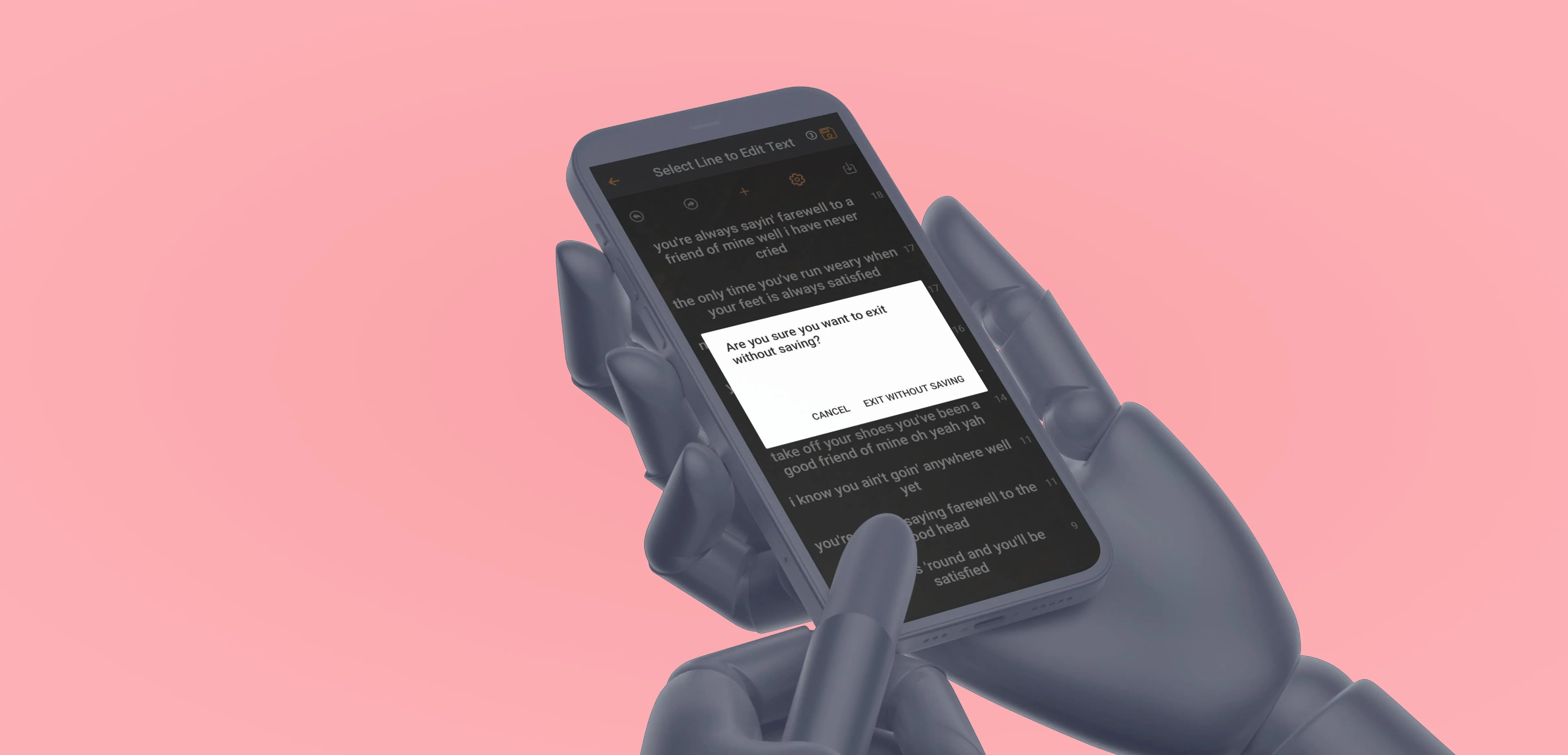
A quick note about destructive actions
Destructive actions can be dangerous.
Imagine you write songs for a living, and you charge $5400/song. Somewhere in the menu, you tap the wrong option and delete a folder with 18 songs in it. Irreversibly.
That's a $97,200 super ouch!
The good folks at MyLyricsMaker recognized this as soon as we pointed it out to them.
They implemented destructive action interrupts, and so should you!

Next steps
MyLyricsMaker is an early stage startup, and pushes updates to the Apple and Google Play stores regularly.
While our consultations added meaningful change and clarity to the experience of using the app, it continues to evolve.
As the app grows in popularity, users will want:
1. More minute control.
2. Enhanced functionality in auxiliary features.
One example might be enabling a tap-and-hold interaction that allows users to drag a line to any other place in a verse.
These types of enhancements will provide an ease of use and wow factor that can make it a favorite in the B2C Generative AI marketplace.
As these functions roll out, it's essential that MyLyricsMaker conducts meaningful user testing and maintains a lasertight focus on the specific value MyLricsMaker provides to its users.
MyLyricsMaker is a Generative AI-based lyrics creation mobile app. You can find it at the Apple and Google Play stores.
End

