Background
The
UX Wizards are a community of UX Enthusiasts based in the SF Bay Area. The group started small, with only a few individuals sharing access to a brand guide housed in an Adobe XD file. The
group has grown to include members from all over the world, and it’s time to
move the brand guide online.
In a
previous project, I was part of a team that created the
first iteration of the UX Wizards' design system website. The project has been
live for six months, we've collected use data, and we are
making improvements.
My role
As part of a team of three, I helped design the use guidelines updates. I wrote copy across the page, and revised existing copy so that everything fit together cohesively. Then I wrote the front end code to implement the updates.
Project overview
The project included:
• Designing the Use Guidelines updates
• Revising the existing site to fit with the new content
• Updating the Colors Page code in GitHub for deployment

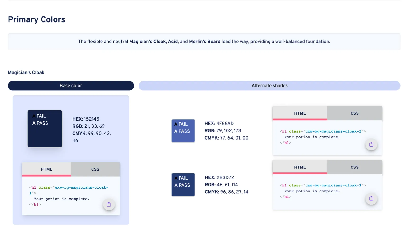
Starting point: the first build of the design system's colors page
Above, you see the UX Wizards design system colors page at its first release. We talked to creators about how they were using the page, talked to leadership about their plans for the future, and looked at the future plans for the design system website. We learned some things:
• Most people only use the site to pull the HEX code for their designs
• Leadership has no plans to create print materials in the near to medium term future
• The web team plans to add a Components page for the design system site
• Website developers want to access each color's token name
• Base color and Alternate shades headers were overshadowing the color's name
• We need to provide more guidance on color use
With these insights, we updated the design.
This happened in two sections: Use Guidelines and Building the Page, which I'll talk about separately.
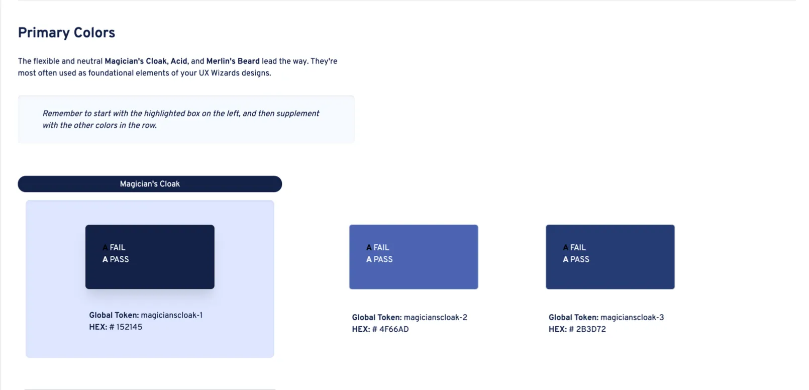
Below, you see the second release of the design system's colors page.

Tools
Use guidelines
With a team of three, we created use guidelines for the UX Wizards colors. By collaborating with the graphics and web teams as well as leadership, we picked out which colors are acceptable for use in background colors, headers, text, and more.
The process of selecting the colors was mostly done descriptively, instead of prescriptively, as lots of UX Wizards assets already existed on the design system website. We also added error and success colors by choosing a green and a red that fit with the color palette of UX Wizards, which was then approved by leadership.
The story here isn't which colors we chose, but how we displayed them.
What goes where?
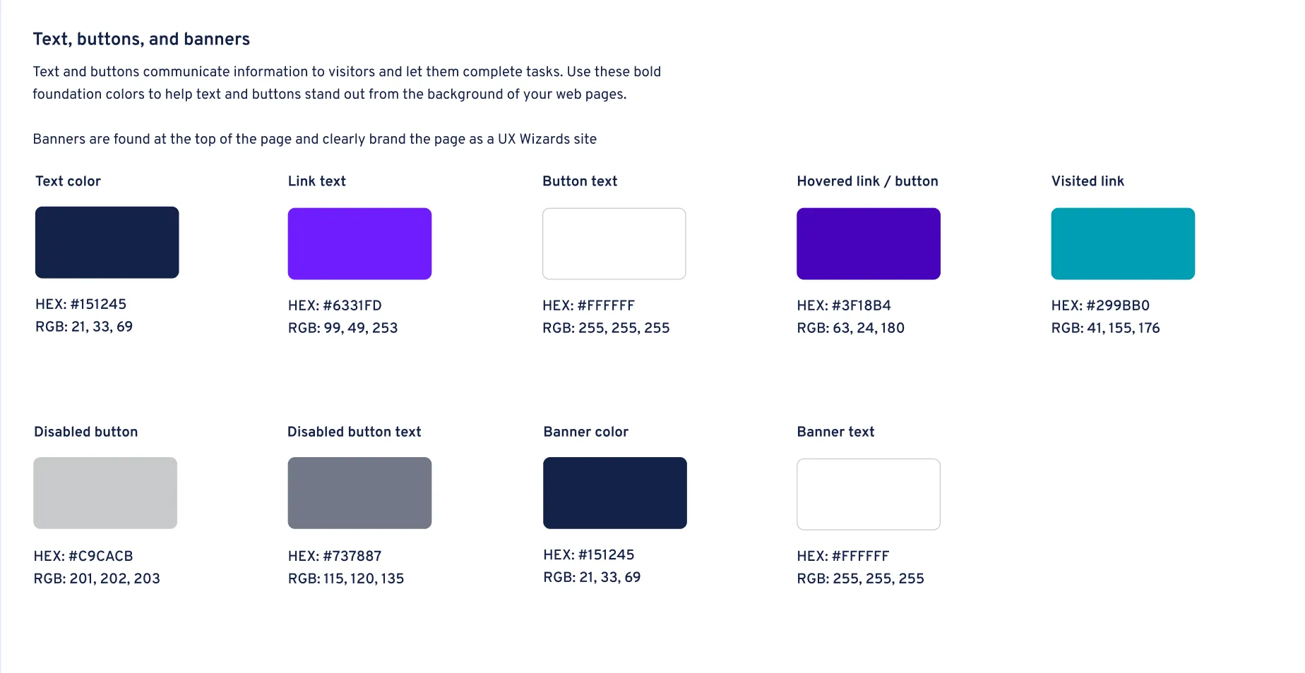
At first, we split colors between objects and environments. With this mindset text, buttons, and banners were all treated as objects, and went into the same nav category.

That approach didn't work. When we tested the design with our web team, people spent a long time looking for specific items. If they want a hovered link, it's buried in a list of many other things. Lumping all objects into one category was not the way.
We split each type of item into a different category, and people found their targets much faster.

The next challenge was how to design the navigation system.
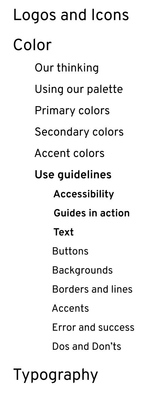
Third-level navigation
Our original approach was to build a third level into the navigation menu.

A constraint from engineering was that creating a third level in a navigation menu is much more difficult than creating a second. We were asked to come up with a different way, so we did.
Users can click "Use guidelines" in the nav, and then use a text link to scroll down the page. Problem solved.
Note: React Router doesn't use Hash Links, but our brilliant engineering team found a workaround! Thanks y'all.

Revising content
On the original page, section descriptions were used to give an idea of how Primary, Secondary, and Accent colors could be used.

The descriptions were open ended, and a little clunky. We wanted to enhance the minimalistic feel of the site, and cut the wording back so that it gave a specific instruction, instead of a description.

We eliminated our thinking from these descriptions, and transported rationale to the use guidelines (shown below).

Building the page
There were two challenges in building the webpage. First was the navigation, discussed above. Second was building the do/don't cards. I'll talk about the second challenge in depth here.

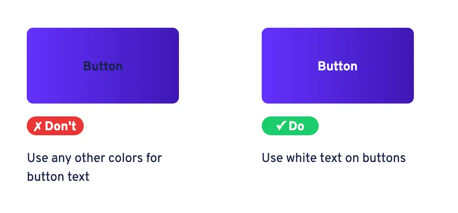
This is the version of the do/don't guidelines that went live.
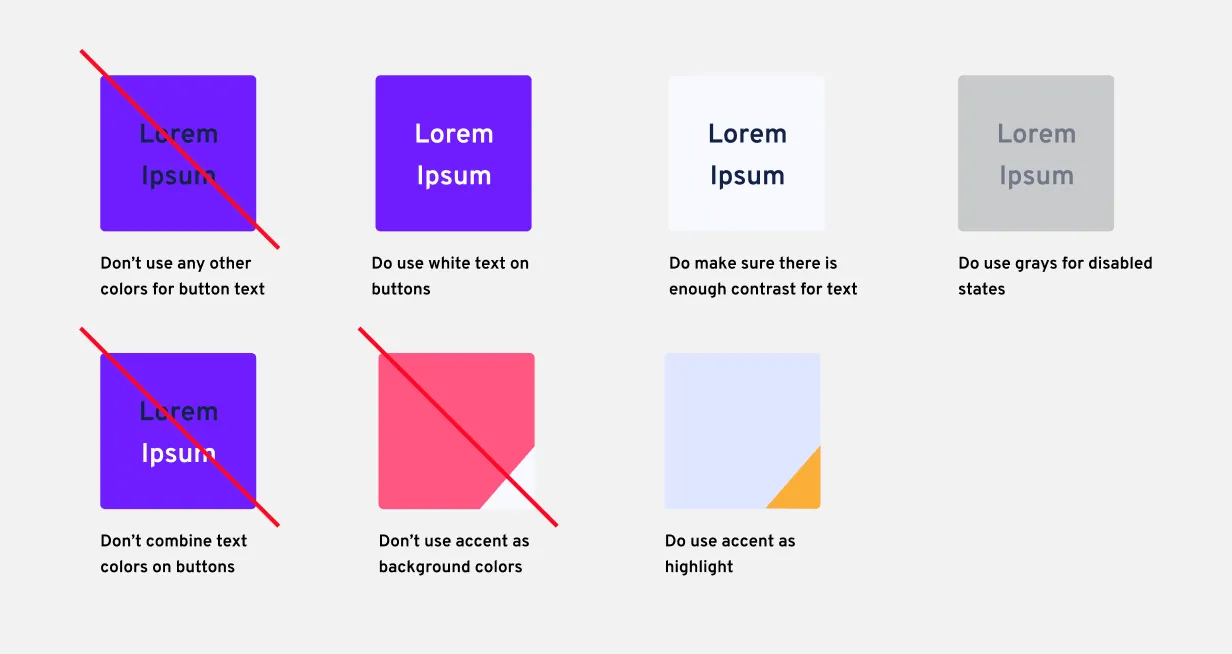
The do/don't guidelines were originally designed like this:

The challenges here were the superimposed line and the corner triangle for accent guidance.
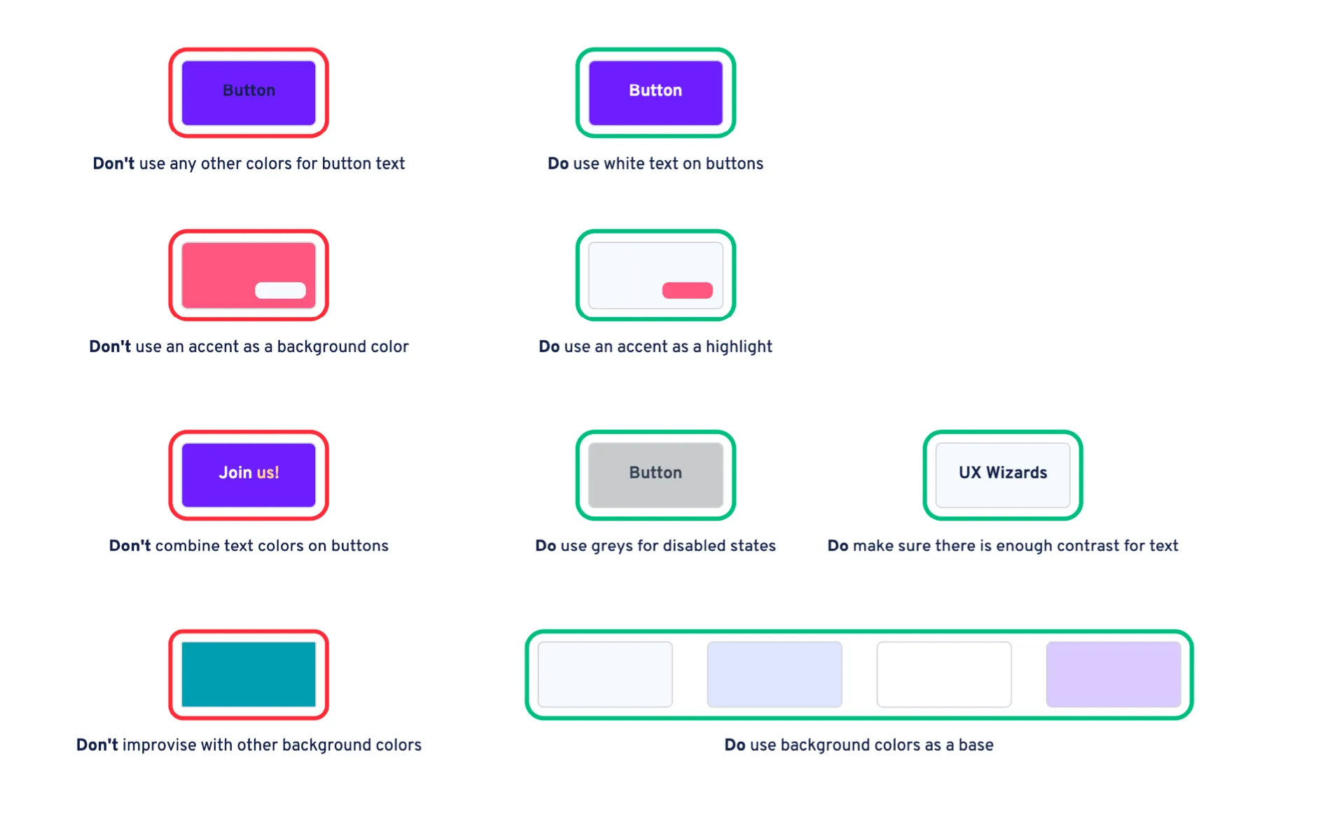
While these work well in a design software, I couldn't find an elegant way to create those effects using Tailwind. I wanted to have the page built with CSS as much as possible—instead of loading images—so I had to find a different way to illustrate the same ideas.
My first attempt was this:

Stakeholders on the leadership team didn't like it, and wanted red and green chips instead of outlines.
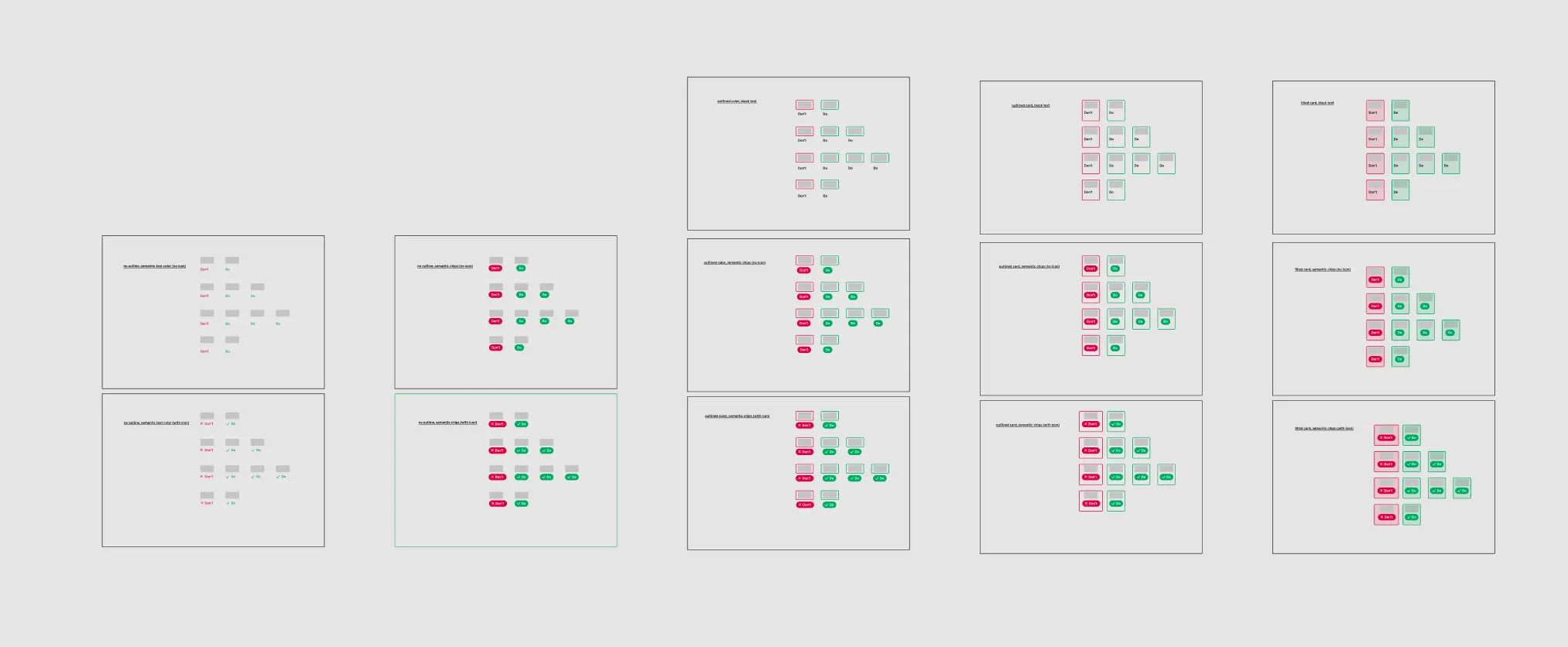
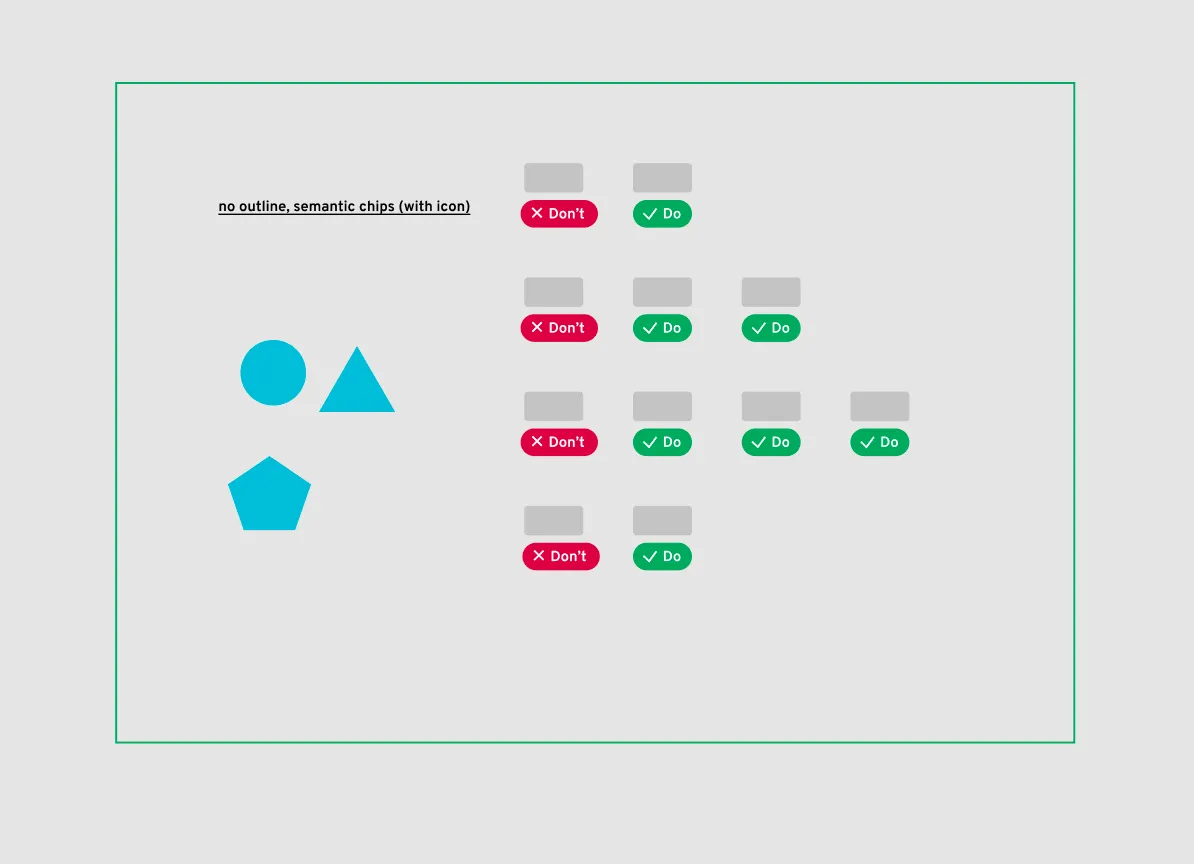
I created a whole set of options with different variables: outlines, text color, chip color, and cards.

After a ranked choice vote with key stakeholders, one of the styles was a winner.

I went ahead with production and shipped the product. Leadership was happy, and it's still live today.

Wrap up
In this case study we talked about
• Revising a do/don't guideline UI based on stakeholder feedback
• Making section descriptions more direct and streamlined
• Navigating a constraint from Engineering
• Getting specific with item grouping
This project included other parts, like giving guidance on color contrast for accessibility, showing how colors can fit together cohesively with a visual reference, and preparing color swatches for a click-to-copy feature that will get built in phase 3. I'm happy to talk about those parts of the project in person.

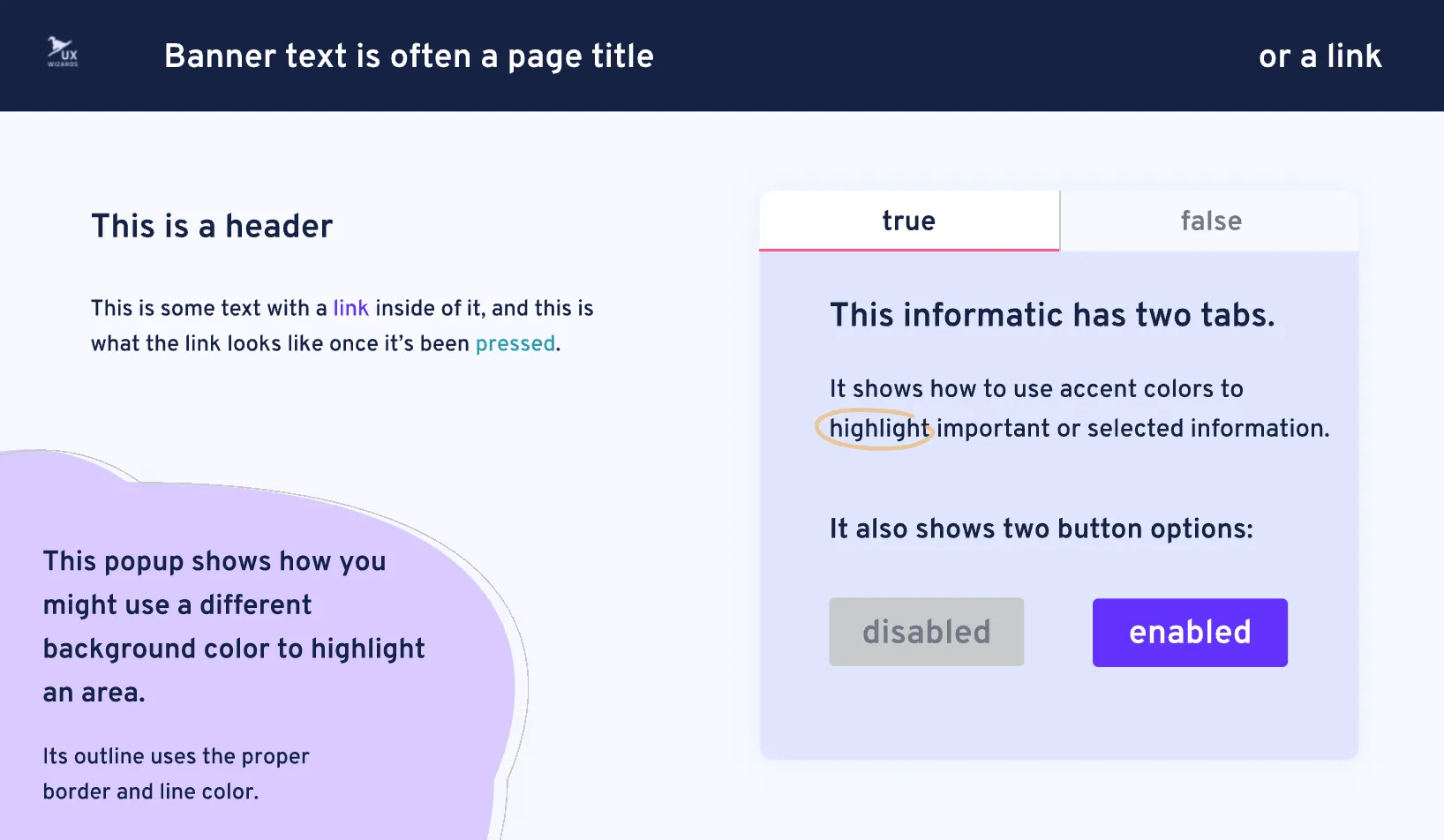
This handy visual reference guide gives an idea of how all the colors can work together to make a cohesive page.
Next steps
The next phase of the refresh will be adding a single-click to copy mechanism on each color swatch. Research suggests users mostly use the site to gather HEX codes, and this click mechanism will reduce clicks and button presses in the HEX copy task from 4 to 1.
I also still recommend the page becomes responsive, but that's a low priority given this site's unique use case.
End


